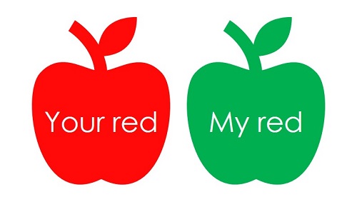
Colour is hue we perceive. Tint, tone and shade add diversities to colours. Every individual perceives colours differently. However, there is no way for us to measure how exactly your red is different from my red. Nonetheless, the use of appropriate colours can help uplift the ambience of a workplace, promote staff’s happiness and sense of identity. Unlike decades ago, where black, white and grey are the most commonly used colours in the workplace, companies are more receptive to adopt bolder colour scheme today.
Colours and Perceptions
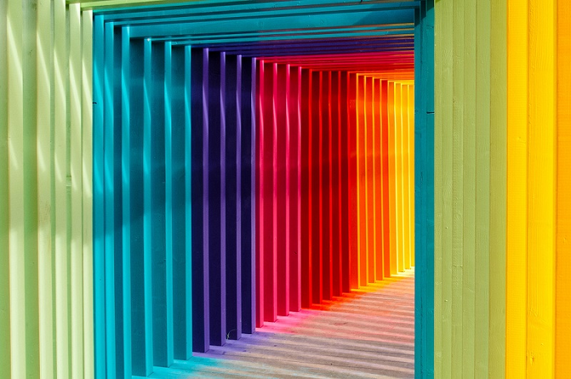
Although a specific colour delivers a set of perceptions, the feels it creates also greatly depend on the level of tint, tone and shade. The colour guide below is meant to be a general reference only.
Yellow (primary colour)
Optimism, warmth, creativity, fun, welcoming, energy.
Green (primary colour)
Creativity, harmony, balance, relaxation, eco-consciousness.
Blue (primary colour)
Trust, focus, calm.
Red (primary colour)
Incitement, warmth, alertness, hostility, danger.
Orange
Energy, endurance, creativity.
White
Spaciousness, creativity.
Gray
Unhappiness, lack of confidence.
Tint, Tone and Shade
A colour which is mixed with white becomes tinted; when mixed with gray, it becomes toned; and when mixed with black, it becomes shaded.

Colours for the Special Needs
Visual contrast in building interiors, including signage, wall, ceiling, door, window and hardware such as toilet, facilitate people in wayfinding and identifying objects. A thoughtful design can greatly help those with special needs such as vision-impaired and dementia to gain better independency (read: Creating Dementia-Friendly Environment).
We must acknowledge that everyone sees colours differently. Your red is not my red and it is almost impossible to measure the colour discrepancy between what you see and what I see.
To ensure effective communication through colour, signage should be further enhanced with the use of shape and symbols. Check our blog Workplace for People With Colour Blindness to know more.
Colours for the Elderly
No one can avoid getting older day by day. With the aging workforce, employers need to make their workspace age-friendly to enable their aged employees to perform at their best. Use colours which are easily perceived by the elderly, avoid colours that confuse them.
Colours as Stimuli
We rely on our senses to stimulate our brain and body so that we can stay alert. Sight, hearing, smell, touch, taste, heat-sense and the feel for gravitational force are all forms of senses. Make good use of colours as a form of visual break, it works well. (Read: Stimuli in the Workplace and Work Performance)
Colours and Lighting
Natural and artificial lighting have a significant impact on colours. The colour shade of an object you see changes throughout the day, depending on the facing of your window. Similarly, incandescent, fluorescent, LED and other types of light bulbs change how colours are perceived too.
Thus, when choosing colours, be sure that the natural lighting and types of light bulbs are complementing so you can achieve the ambience you intend to create.
Conclusion
Selecting the colours which fit to corporate branding (read: Workplace Branding Through Interior Design), couple with the right lighting, sheen, translucency and pattern, a workplace which is thoughtfully designed and built can connect people, contribute to happiness, productivity and delightful human experience.