Glare Reduction for a User-friendly Environment

Glare Reduction and Choice of Colours for a User-friendly EnvironmentAppropriate use of colours can uplift the look and feel of a place. And careful selection of colours in a built environment can have a glare-reduction effect and improve the ability of users especially those who are visually impaired to move around the building.

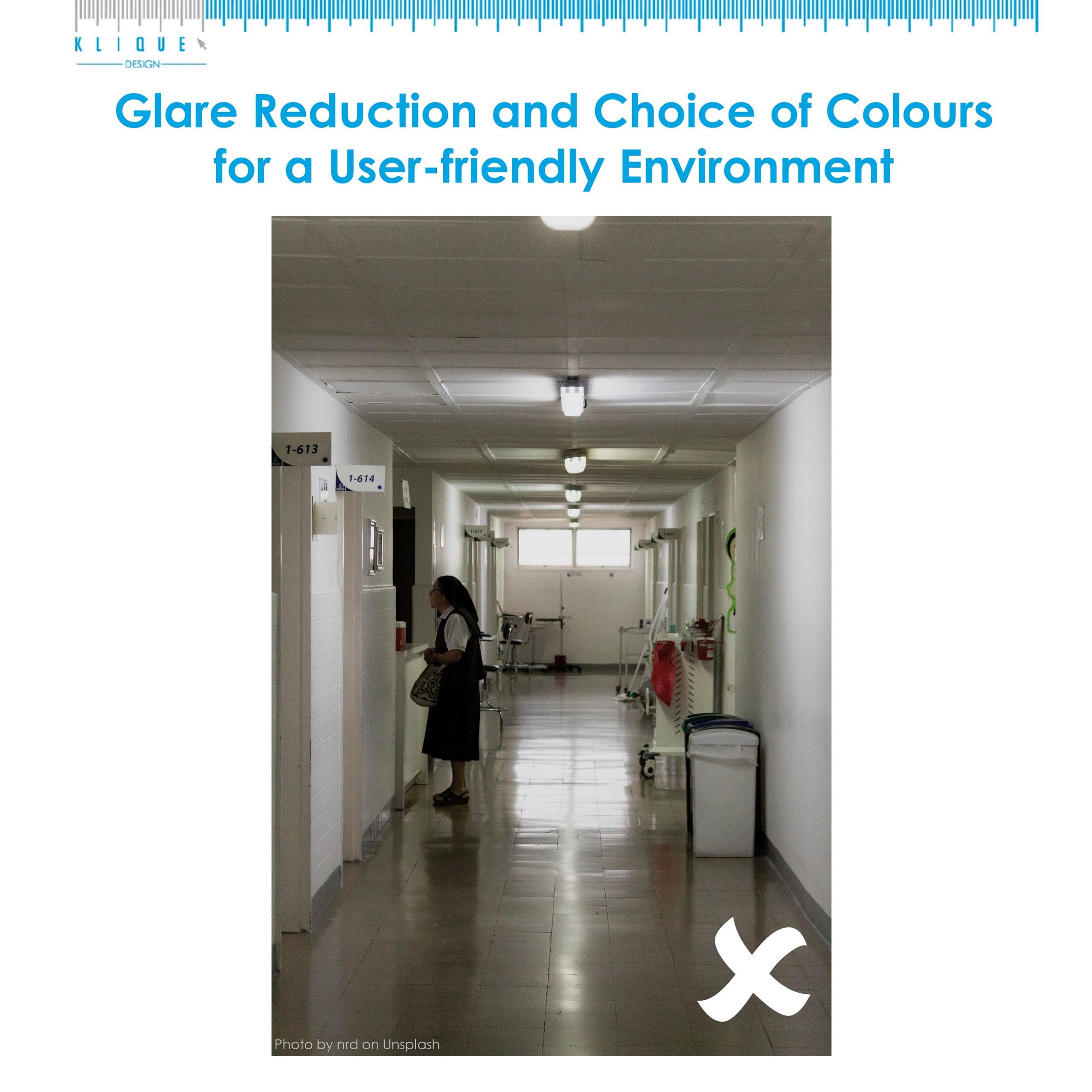
The picture above shows a poorly contrasted wall-floor colour. The floor also creates glare which is hard for people to see clearly. With glare reduction measures and right choice of colours listed below, we can enhance the accessibility of a premises.
1. Use glare-reducing treatments on exterior facing windows and all glass walls.
2. Remove, reduce or relocate materials or light sources that cause glare.
3. Use non-glare flooring materials throughout the building.
4. Use non-glare materials over wall hanging pictures and signage.
5. Filter natural daylight penetrating interior spaces to reduce direct glare.
6. Use contrasting colours between the wall-floor and floor-furniture.
7. Colours that contain a greater amount of white will reflect more light.
8. Use matter finishes in pale colours on horizontal surfaces to reduce indirect glare and enhance brightness by adding sheen.

Source: SingHealth

Share this:

Small Motifs and Patterns to Avoid for an Age-friendly Environment

Small motifs and patterns to avoid for an age-friendly environment

Elderly has difficulty perceiving some colours and thus we avoid using them in our design. We put same amount of consideration when using motifs and patterns. We do not encourage our clients to use small motifs and patterns so we can create an age-friendly environment. Motifs and patterns to avoid are:
1. Bold patterns that cause confusing for elderly and have a dizzying effect.
2. Small motifs and patterns on flooring, which can be mistaken by elderly with reduced vision as items dropped on the floor.

Meanwhile, we advise our clients to paint the staircase on their premises to improve the visibility of every step in order to create a safe workplace for their older employees and customers.

Source: SingHealth

Share this:

Colours that Confuse Elderly

Colours appear similar to the elderly

 Certain colours are easily perceived by the elderly and some do the exact opposite.

Colours and patterns that cause confusion to the elderly should be avoided to create an age-friendly environment. They are:
1. Colours such as light salmon, pink and blue that appear similar. The reason is that of the yellowing of an elderly’s eye lens.
2. Lavender that appears muddy.
3. Purple that may appear as brown.
4. Purple and violet used in large area. These 2 colours can cast a yellow-green pallor on afterimage.
5. Yellow. It can decrease motor ability and increase shaking for people with palsy.
6. Bold patterns and small motifs.

Source: SingHealth

Share this:

10 Common Symptoms of Persons with Dementia

10 common symptoms of person with dementiaWhat are the symptoms of persons with dementia? We can help our loved one with early intervention if we know what is the telltale signs of dementia.

Problems with recent memory

They often forget recently learnt information. They may forget important dates or events, and ask for the same information repeatedly. The memory loss can affect their daily routine.

Problems with visual perception

They may have difficulties identifying objects in a familiar environment, and be unable to judge distances and depths correctly. Activities like reading and driving may become challenging. Continue reading “10 Common Symptoms of Persons with Dementia”

Share this: